Carebaker
Industry
Baked Goods
Brief
Branding
Deliverables
- Branding
- Packaging
- Company Collaterals
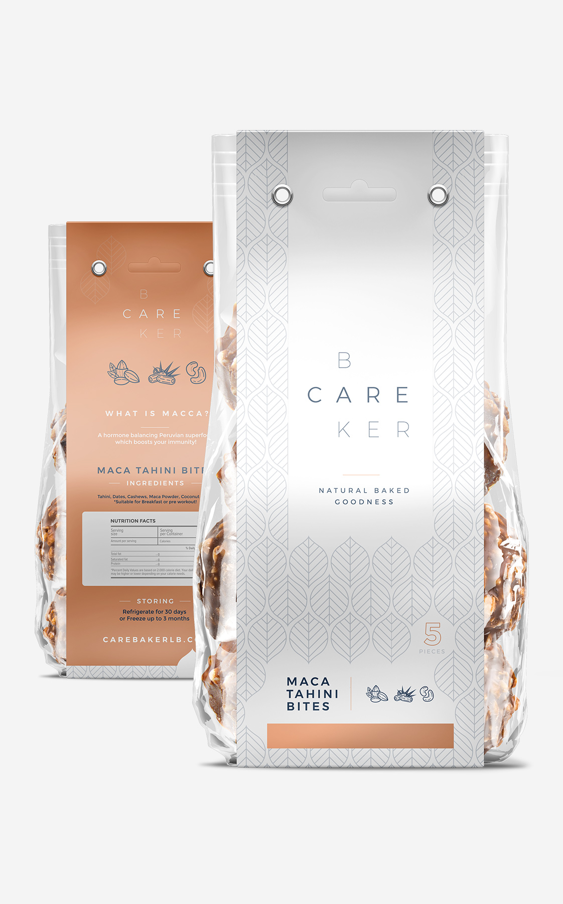
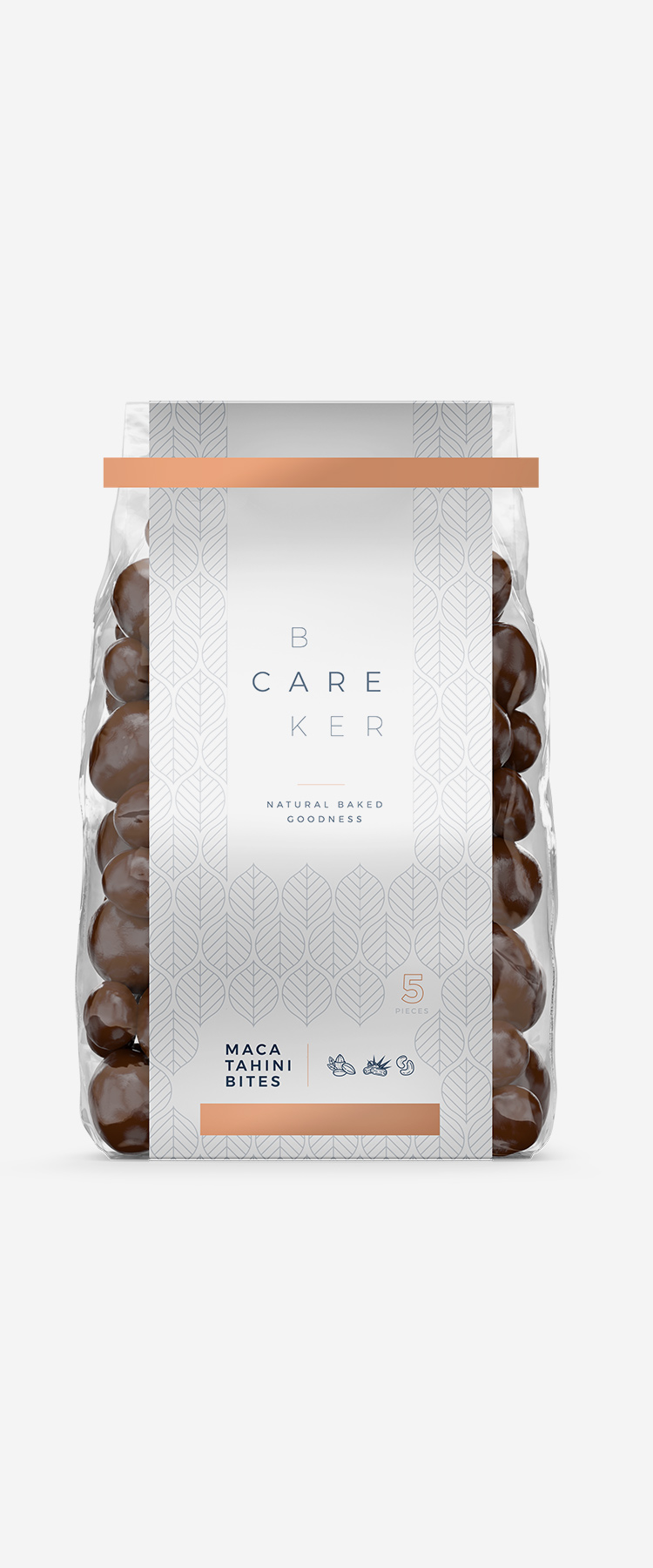
An overall simple packaging that showcases what is good and in store for you.
Wholesome products for snacking and nibbling feel even more innocent to the health with a branding approach that is soothing to the eye. Seen everywhere from the logo itself, to its outdoor signage and overall colors and fonts used, peacefulness remains key in the design along with a touch of flavor and playfulness. Its packaging remains minimal in design, showcasing simplicity and reflecting that being ultra-healthy is anything but dull.
Colors
Smooth Copper
#f6ac86
Evening Blue
#375971
Cool Rain
#d6d5d5
Typography
Montserrat