Solabel
.
.
Industry
Beauty Products
Brief
Brand Identity Revamp
Deliverables
- Brand Identity
- Packaging
Days and preferences have changed along the way, and best to adapt while preserving what was once best.
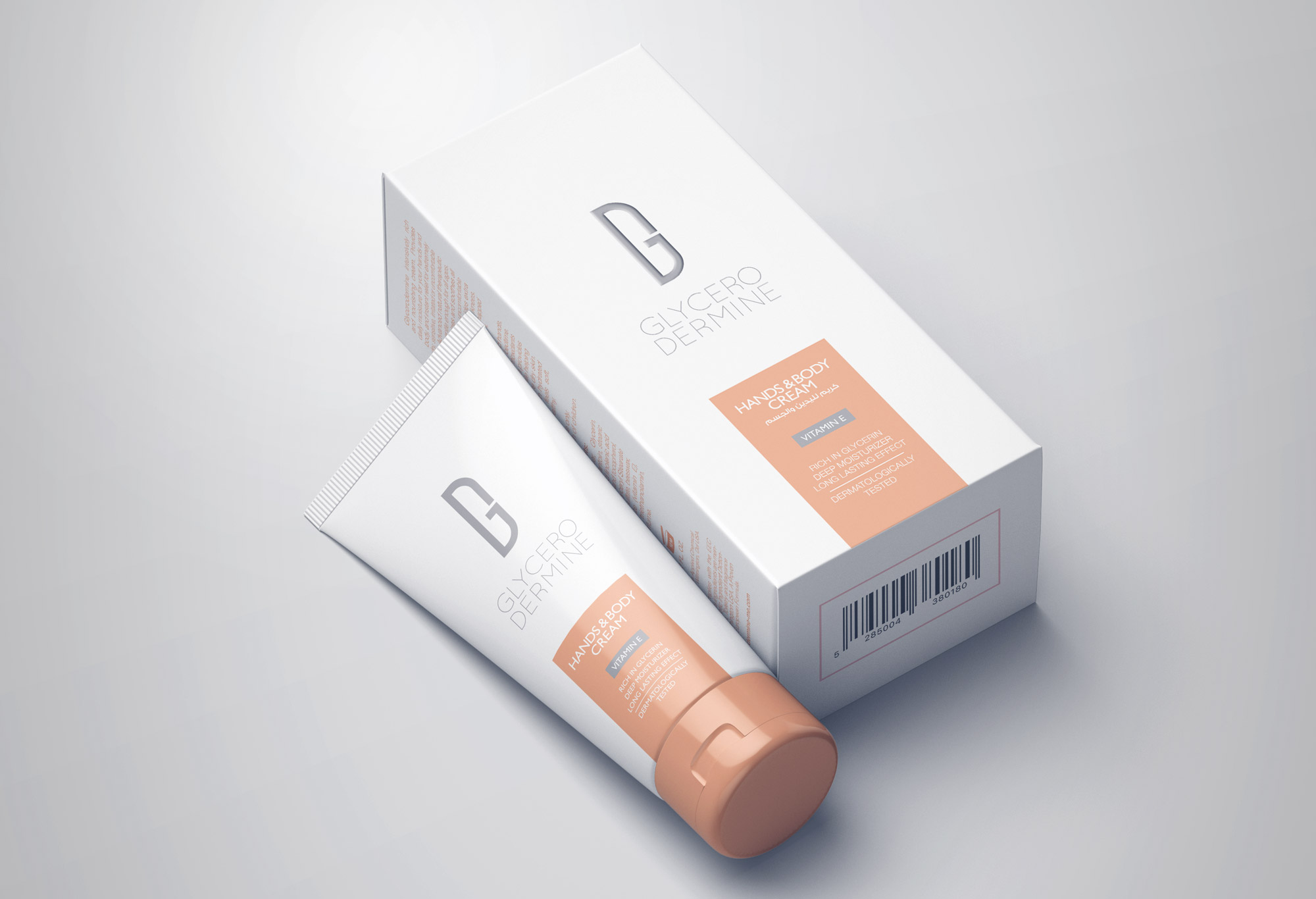
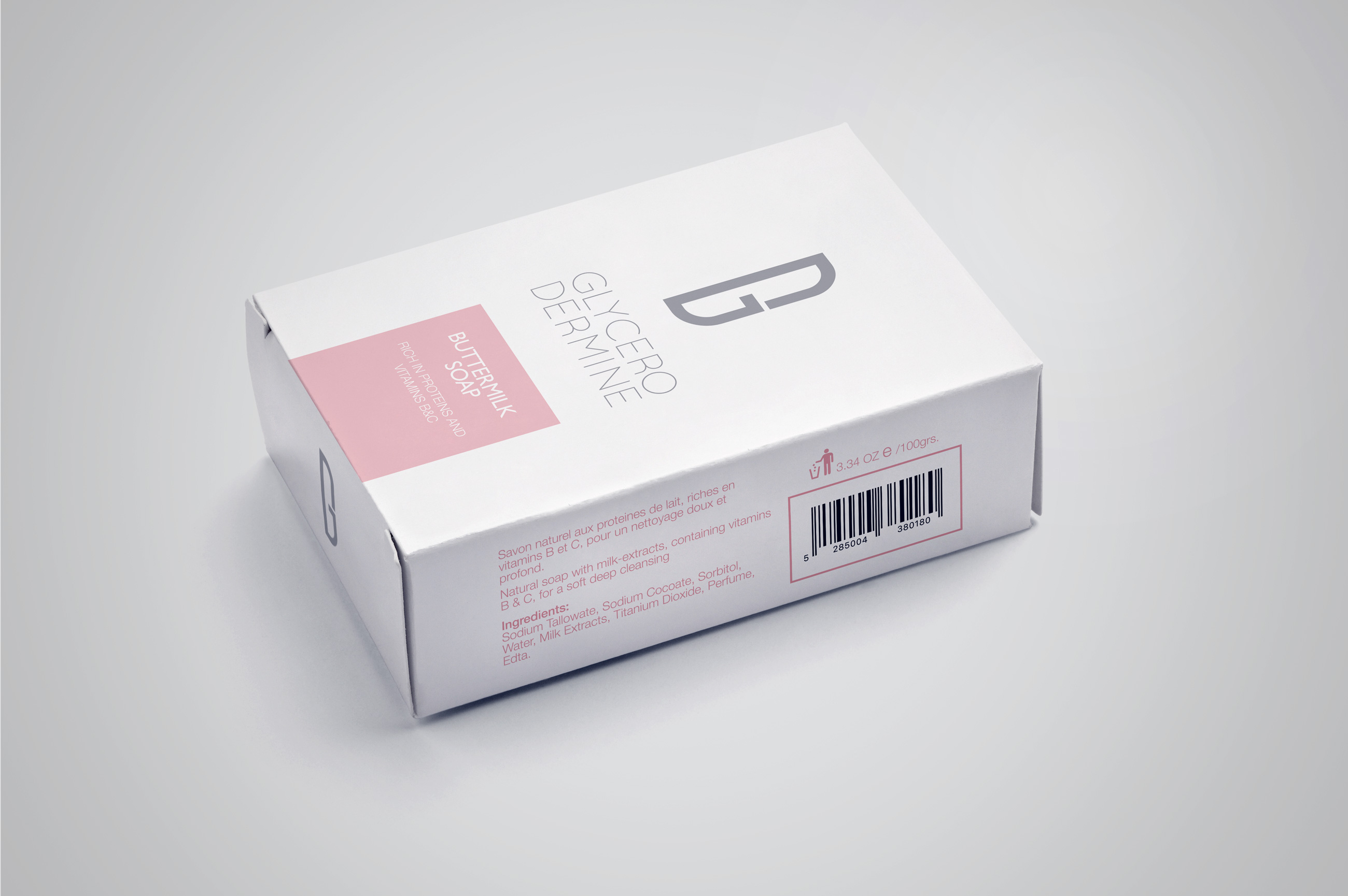
Glycerodermine is a well-established brand that has been on the Lebanese market for decades. Client came to us with an aim to reinvent the look and feel of the brand in order to attract a wider and younger clientele. It has a full lineup of creams including hand cream, body lotion, foot cream, lip balm and sunscreen. The challenge was to create a new image for the brand that would compete with both local and international names, while keeping in mind the needs and wants of its already established clientele.
Brief
The task here was to create an emblem that would have a slightly pharmaceutical edge to it, reflecting the brand essence of the product.
Emblem
The logo at hand is a merge between the letters “G” and “D” in a very purified icon that inspires trust and stability.
Packaging
The task here was to create an emblem that would have a slightly pharmaceutical edge to it, reflecting the brand essence of the product. The logo at hand is a merge between the letters “G” and “D” in a very purified icon that inspires trust and reliability.
Color Scheme
In order to create a balance within the very “square” logo, we’ve opted to use a younger and fresher color scheme that would add vibrancy to the products while remaining appealing and soothing to the eye.